Ubuntu 11.10 Oneiric Ocelot final release happened sometime ago. I have been using Ubuntu 11.10 as my default netbook OS ever since Oneiric Alpha 2 was released. So it's not like I am installing Ubuntu 11.10 just for the sake of reviewing it. Ubuntu 11.10 Oneiric Ocelot has been the OS of choice in my netbook for sometime now.
Ubuntu 11.10 Oneiric Ocelot Review, Screenshots, Download Links
Unlike many among you, I am a self confessed Unity lover. I love the Unity UI so much that, I reviewed the previous Ubuntu 11.04 Natty Narwhal release as my favorite Ubuntu ever. A bit far fetched, you might say. Well, that's my point of view. Me being a non-desktop user might be affecting my judgements. I own a 15.4" Lenovo laptop and a 10.1" Acer Aspire One netbook. Laptop runs Ubuntu only, while netbook has Joli OS and Ping-Eee OS installed along with latest Ubuntu 11.10 Oneiric Ocelot.
Ubuntu 11.10 Oneiric Ocelot does not bring in sweeping changes as its predecessor did. But it does bring in a lot of polish to the controversial Unity UI. Also, Ubuntu's underlying platform moved away from GNOME 2.0 to GNOME 3.0, which can be termed as the single biggest change brought about by Ubuntu Oneiric release cycle.
Brand New Wallpapers
This is something that happens with every new Ubuntu release cycle. But this time, it is worth mentioning. Because I think, the default set of wallpapers chosen for Ubuntu 11.10 Oneiric Ocelot is perhaps the best collection yet. More screenshots and download link for these wallpapers can be found here(if you are not an Ubuntu 11.10 user ie).
Lots of Improvements to Unity
Ubuntu 11.10 Oneiric Ocelot, as expected, brings in a lot of improvements and some much needed fit and finish to the Unity UI. Below are some of them worth mentioning.
LightDM is the new default login window manager for Ubuntu. Among many advantages, LightDM brings in the ability of easy customization. And the results are there for everyone to see. Ubuntu Oneiric has got perhaps the most professional looking login screen ever.
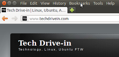
Global Menu has always been a topic of heated debates. It saves vertical space big time and is a very nifty feature for smaller screen devices. But the relevance of global menu on bigger screen devices is the contentious issue. Anyway, Ubuntu 11.10 has polished global menu a bit more. Now, there are no close/minimize/maximize buttons on top by default.
And only when you hover on the top panel, window buttons and other options are displayed. When used along with GNOME Shell, I can see how much vertical space Unity actually saves because of this nice little feature called Global Menu. I'm all for it.
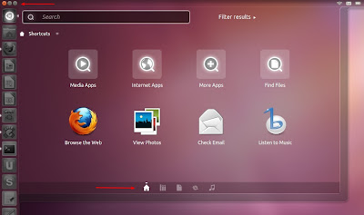
Apart from the aesthetic improvements like better polish and beautiful new transparency effect, Unity Dash comes with some new features as well. The little icons you see at the bottom are different Unity lenses (Apps, Files, a new Music lense and Gwibber). Which means, there are no dedicated Unity lenses for Apps and Files in launcher any more(though you can still launch Unity lenses for Apps and Files using shortcuts Super+a and Super+f). The Ubuntu button(the one which opens Dash) is now on the launcher and there is a new minimise/maximise/close button for Unity dash also(see marked regions of the above screenshot).
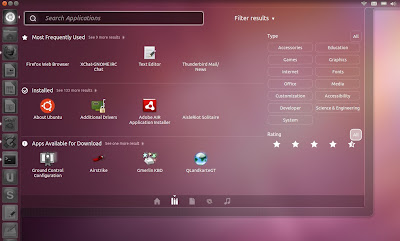
Applications lense itself has improved by a wide margin. As you can see, there are easy filtering options now which lets you find your favourite applications without typing anything(one of the biggest complaints about original Unity Dash). And there is a 'search by rating' filter too.
The reworked Alt+Tab is another major highlight.
While in Alt+Tab, you can see individual windows using ` key(the one above Tab key in your keyboard). Of course you can map it to other keys if you want, using CCSM.
If multiple instance of same window(nautilus here) is opened, you can use the shortcut key ` to reveal it(while in Alt+Tab). Down arrow key also works.
Reworked power button menu. Everything you basically need is now just a click away. And unlike GNOME Shell, you do have Shut Down button.
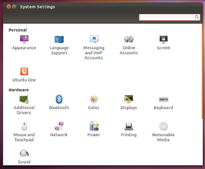
GNOME Control Center is also there by default and it is accessible from power button menu. See the 'System Settings' option in the screenshot prior to this.
GNOME Shell
If you ask me what is the single biggest thing I like about Ubuntu 11.10, it is undoubtedly the ability to install GNOME Shell in a jiff. Of course this has nothing to do with something Ubuntu devs did(nothing directly anyways), its just that Ubuntu upgraded itself from GNOME 2.0 to GNOME 3.0 platform, which is what GNOME Shell is based on.
Why is it important? Answer is simple. Instead of one simple GNOME interface, now you have two, each one unique and special in its own way. And as some one who likes to play around with different Linux distros and interfaces, this is a welcome development for me. Just search for 'GNOME Shell' in Ubuntu Software Center to install it. For more detailed analysis, read our full fledged GNOME Shell in Ubuntu 11.10 Oneiric Ocelot review.
Ubuntu Software Center Improvements
Those of you who thought Ubuntu Software Center overhaul is all finished, you are in for a surprise. Ubuntu Software Center received perhaps the biggest amount of changes this time around. Native apps like Ubuntu One and Ubuntu Software Center are now better integrated with the default looks of Ubuntu.
Everything about it has changed. To pull of this feat in such a short span of time is something Ubuntu devs can be proud of. And many popular apps like Oil Rush RTS game has already find its place in Software Center. Euphoria apart, Ubuntu Software Center has its fair share of rough edges and missing features. We will discuss that in detail in another post very soon.
Ubuntu 11.10 Oneiric Ocelot Review - In Conclusion
There are no arguments on one basic fact. Canonical is not sitting idle, keeps on pushing boundaries towards a better overall Linux desktop experience. Some like the changes, some don't. Ever since Unity was officially launched some 6 months ago, we have been continuously gauging reactions of users from different parts of the world.
Many are extremely positive while many others hate it to the core. Does the latest Ubuntu 11.10 Oneiric Ocelot release capable of bringing a positive change in the hearts and minds of those you can't stand Unity? We will soon find out. I for one still thinks Unity has a lot of potential and the current Ubuntu 11.10 release marks the first real step in its march towards 200 million users aka mass adoption. Download Ubuntu Oneiric and let us know your opinions.
Recommended read: Things to do after installing Ubuntu 11.10 Oneiric Ocelot
Ubuntu 11.10 Oneiric Ocelot does not bring in sweeping changes as its predecessor did. But it does bring in a lot of polish to the controversial Unity UI. Also, Ubuntu's underlying platform moved away from GNOME 2.0 to GNOME 3.0, which can be termed as the single biggest change brought about by Ubuntu Oneiric release cycle.
Brand New Wallpapers
This is something that happens with every new Ubuntu release cycle. But this time, it is worth mentioning. Because I think, the default set of wallpapers chosen for Ubuntu 11.10 Oneiric Ocelot is perhaps the best collection yet. More screenshots and download link for these wallpapers can be found here(if you are not an Ubuntu 11.10 user ie).
Lots of Improvements to Unity
Ubuntu 11.10 Oneiric Ocelot, as expected, brings in a lot of improvements and some much needed fit and finish to the Unity UI. Below are some of them worth mentioning.
LightDM is the new default login window manager for Ubuntu. Among many advantages, LightDM brings in the ability of easy customization. And the results are there for everyone to see. Ubuntu Oneiric has got perhaps the most professional looking login screen ever.
Global Menu has always been a topic of heated debates. It saves vertical space big time and is a very nifty feature for smaller screen devices. But the relevance of global menu on bigger screen devices is the contentious issue. Anyway, Ubuntu 11.10 has polished global menu a bit more. Now, there are no close/minimize/maximize buttons on top by default.
And only when you hover on the top panel, window buttons and other options are displayed. When used along with GNOME Shell, I can see how much vertical space Unity actually saves because of this nice little feature called Global Menu. I'm all for it.
Applications lense itself has improved by a wide margin. As you can see, there are easy filtering options now which lets you find your favourite applications without typing anything(one of the biggest complaints about original Unity Dash). And there is a 'search by rating' filter too.
The reworked Alt+Tab is another major highlight.
While in Alt+Tab, you can see individual windows using ` key(the one above Tab key in your keyboard). Of course you can map it to other keys if you want, using CCSM.
If multiple instance of same window(nautilus here) is opened, you can use the shortcut key ` to reveal it(while in Alt+Tab). Down arrow key also works.
Reworked power button menu. Everything you basically need is now just a click away. And unlike GNOME Shell, you do have Shut Down button.
GNOME Control Center is also there by default and it is accessible from power button menu. See the 'System Settings' option in the screenshot prior to this.
GNOME Shell
If you ask me what is the single biggest thing I like about Ubuntu 11.10, it is undoubtedly the ability to install GNOME Shell in a jiff. Of course this has nothing to do with something Ubuntu devs did(nothing directly anyways), its just that Ubuntu upgraded itself from GNOME 2.0 to GNOME 3.0 platform, which is what GNOME Shell is based on.
Why is it important? Answer is simple. Instead of one simple GNOME interface, now you have two, each one unique and special in its own way. And as some one who likes to play around with different Linux distros and interfaces, this is a welcome development for me. Just search for 'GNOME Shell' in Ubuntu Software Center to install it. For more detailed analysis, read our full fledged GNOME Shell in Ubuntu 11.10 Oneiric Ocelot review.
Ubuntu Software Center Improvements
Those of you who thought Ubuntu Software Center overhaul is all finished, you are in for a surprise. Ubuntu Software Center received perhaps the biggest amount of changes this time around. Native apps like Ubuntu One and Ubuntu Software Center are now better integrated with the default looks of Ubuntu.
Everything about it has changed. To pull of this feat in such a short span of time is something Ubuntu devs can be proud of. And many popular apps like Oil Rush RTS game has already find its place in Software Center. Euphoria apart, Ubuntu Software Center has its fair share of rough edges and missing features. We will discuss that in detail in another post very soon.
Ubuntu 11.10 Oneiric Ocelot Review - In Conclusion
There are no arguments on one basic fact. Canonical is not sitting idle, keeps on pushing boundaries towards a better overall Linux desktop experience. Some like the changes, some don't. Ever since Unity was officially launched some 6 months ago, we have been continuously gauging reactions of users from different parts of the world.
Many are extremely positive while many others hate it to the core. Does the latest Ubuntu 11.10 Oneiric Ocelot release capable of bringing a positive change in the hearts and minds of those you can't stand Unity? We will soon find out. I for one still thinks Unity has a lot of potential and the current Ubuntu 11.10 release marks the first real step in its march towards 200 million users aka mass adoption. Download Ubuntu Oneiric and let us know your opinions.
Recommended read: Things to do after installing Ubuntu 11.10 Oneiric Ocelot


