Ubuntu 11.10 Oneiric Ocelot is marching ahead. Through our detailed reviews of Alpha 2 and Alpha 3 releases, we followed Ubuntu 11.10 in its each and every developmental phase so far. A lot of things have changed since the third alpha release and as we had promised, here is a preview of latest round of changes in Ubuntu 11.10 and a quick screenshot tour.
Ubuntu Software Center is in the limelight yet again. Software Center overhaul is in full swing and the good news is, no need to wait till Ubuntu 12.04 to see the changes for yourself, its already happening with default Ubuntu Software Center in Ubuntu 11.10. More details on the latest round of Software Center related improvements can be found here.
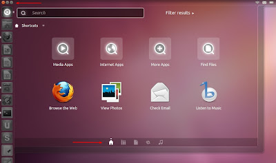
Apart from the aesthetic improvements like better polish and beautiful new transparency effect, Unity Dash has some new feature additions as well. The little icons you see at the bottom are different Unity lenses (Apps, Files, a new Music lense and Gwibber). Which means, there are no dedicated Unity lenses for Apps and Files in launcher any more. The Ubuntu button(the one which opens Dash) is now on the launcher and there is a new minimise/maximise/close button for Unity dash also(see marked regions of the above screenshot).
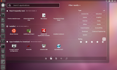
Applications lense itself has improved by a wide margin. As you can see, there are easy filtering options now which lets you find your favourite applications without typing anything(one of the biggest complaints about original Unity Dash). And there is a 'search by rating' filter too.
There is now this beautiful blur effect for windows behind Unity dash. In this particular screenshot, you could see blurred totem media player behind Unity dash.
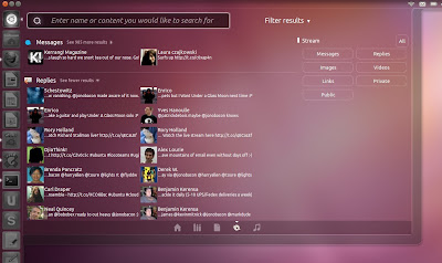
Different Unity lenses has different set of filters now. See the screenshot of Gwibber lense above for example. But at the moment, 'filter results' option is not properly seen in smaller screen devices like netbooks. But that's ok I guess, Oneiric is not even a beta candidate yet.
Canonical has this habit of stirring up controversies with every new Ubuntu release. It's no different this time too. And it's about window buttons yet again. Close/Maximize/Minimize buttons are invisible by default(for maximised windows ie.) and they will appear only while you move the cursor over it. Screenshot above will give you an idea.
Latest iteration of Ubuntu 11.10 introduced two new icons. There is a new launcher item for Unity Dash instead of Ubuntu button on top like it was before. There is a new default icon for Ubuntu Software Center as well. Both new icons are marked in the screenshot above.
Switching between different user accounts has never been easier.
New power button menu. Everything you basically need is now just a click away.
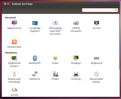
GNOME Control Center is also there by default and it is accessible from power button menu. See the 'System Settings' option in the screenshot prior to this.
The new Appearance menu looks professional.
The reworked Alt+Tab is another major highlight.
While in Alt+Tab, you can see individual windows using ` key(the one above Tab key in your keyboard). Of course you can map it to other keys if you want, using CCSM.
If multiple instance of same window(nautilus here) is opened, you can use the shortcut key ` to reveal it(while in Alt+Tab). Down arrow key also works. Overall I am simply overwhelmed by the sheer amount of changes brought about by Oneiric in such a short span of time. The only thing I miss are some of those really useful Quicklists for Unity which we featured for Ubuntu 11.04.
PS: Some screenshots via Jonobacon's blog. As noted earlier, layouts of different windows in Ubuntu Oneiric doesn't look very good in my netbook, especially so with Unity Dash, Unity lenses etc. And hence those borrowed screenshots.


